Branding Guidelines
Logotypes
Primary Logo
Secondary Logo
Only for use if primary gradient logo is impractical
Usage

Clearspace
In order to preserve the integrity of the Primary Logotype, it is important that no other logos, type or other graphic elements infringe on its space. The minimum clearspace to be around the logotype is equivalent to 1/2 of the height of the logotype.

Minimum Digital Size - 100px width | Minimum Print Size - 0.8" width
Improper Use

No altering logo form

No altering logo colors

No added effects or styles

No added elements to logo
Colors

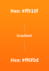
RGB: 255,145,15 | CMYK: 0, 43, 94, 0 | Pantone: 1495 C
to
RGB: 255,111,13 | CMYK: 0, 56, 95, 0 | Pantone: 1505 C

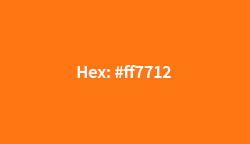
RGB: 255,119,18 | CMYK: 0, 53, 93, 0 | Pantone: S/C 158 C

RGB: 26,26,26 | CMYK: 0, 0, 0, 90 | Pantone: S/C Neutral Black C
Font


Source Sans Pro is the primary brand font and should be used alongside the Madwire® brand when possible.
Trademarks

Clearspace
In order to preserve the integrity of the Primary Logotype & trademark, it is important that no other logos, type or other graphic elements infringe on its space. The minimum clearspace to be around the logotype & trademark is equivalent to 1/2 of the height of the logotype & trademark.

Clearspace
In order to preserve the integrity of the Primary Logotype & trademark, it is important that no other logos, type or other graphic elements infringe on its space. The minimum clearspace to be around the logotype & trademark is equivalent to 1/2 of the height of the logotype & trademark.
Partnerships

Partner Lockups
Logotype partner lockups should be scaled to the approximate same size and center aligned. The minimum clearspace to be around the logotype is equivalent to 1/2 of the height of the logotype. The correct space between partner logo lockups is equivalent to the height of the logotype, with an added divider.


Incorrect Use


Copy
Correct
Madwire®
Incorrect
MadWire® | madwire® | MADwire® | Madwire


